PHOTO: CoreLogic
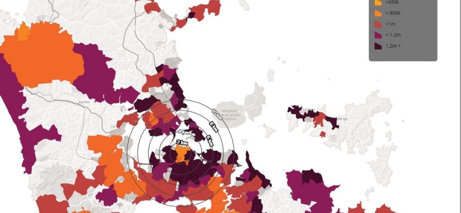
CoreLogic NZ’s latest ‘Mapping the Market’ (June 2019) report has just been released, using location analytics and geospatial expertise to give visual learners a better understanding of New Zealand’s property market. View here.
The constantly changing dynamics of New Zealand’s property market means that many would-be homeowners find it challenging to understand which suburbs currently match their home-buying budgets, but as CoreLogic senior economist Kelvin Davidson explains: “Like the saying goes: sometimes, a picture really can paint a thousand words. This updated visualisation tool uses GIS technology (and millions of data-points in the background) to deliver an easy to interpret explanation of the current property market. Click on a particular suburb anywhere in NZ and instantly see its current median property value”.
“It’s ideal for discovering other suburbs that may have previously been excluded from a homebuyer’s frame of reference. We used colour-blocking to show median values of one area relative to their surrounds…basically, anything dark purple means the suburb median is high for that particular market – in the case of Auckland, roughly $1.3m+. By contrast, the light orange sections show where you can still score property for much lower prices. It’s very easy to see which local suburbs sit within a particular budget”, Mr Davidson comments.
READ MORE VIA CORELOGIC


