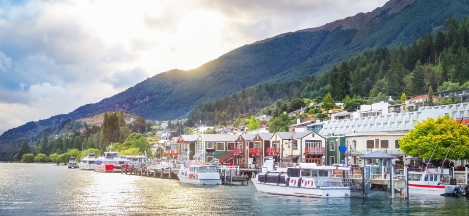
PHOTO: Queenstown
In the coming months, all parts of the country are likely to feel some degree of property pain. But based on a simple ranking across a range of indicators, Queenstown’s market looks the shakiest. By contrast, Whangarei, Hamilton, and Invercargill appear to be a bit less risky. Factors in favour of these ‘safer’ areas include less tourism reliance and not as big a surge in investor activity in their property markets of late.
Clearly there is a tough period ahead for the economy, with GDP set to fall sharply and unemployment rising. That will flow through to a weaker property market, but which parts of the country might fare worse (or better) than others? Kelvin Davidson, Senior Economist at CoreLogic New Zealand provides analysis on such factors likely to have a greater impact in certain markets more than others.

Starting with the economic base/structure of various areas, unfortunately for Queenstown, it has nearly 20% of its output coming from accommodation & food services (see the first chart) – and this is a sector set to be hit hard by the various stages of lockdown and the tourism downturn. Indeed, the Reserve Bank has estimated that accommodation & food services was only operating at 11% of pre-coronavirus norms during alert level four, rising to only 19% during level three. For context, the government sector was estimated to be operating at 90% at both alert levels.
Elsewhere around the country, e.g. in Tauranga or Wellington, accommodation & food services accounts for a much smaller share of the economy. And Wellington, for example, also has a high share of activity in relatively ‘safe’ sectors such as professional services, central government, and healthcare. In other words, areas of the country with more diverse economies (and less concentration in tourism) should fare a little better.

We’ve also looked at areas where investors have recently had high shares of property purchases, as these could now be the markets most vulnerable to an investor reversal (perhaps as their tenants start to struggle and the rental returns suffer). As the second chart shows, Napier for example has recently had a very high investor market share (relative to average), but Kapiti Coast and Hamilton have been lower, and hence possibly more stable.
READ MORE VIA CORELOGIC


